
 Hues You Can Use:
How Corporate Colors Help Build Your Brand
A corporate color palette refers to the set of colors that a company uses for its branding and marketing materials. Most companies choose a distinct and consistent color palette to enhance their brand recognition and make their products and services easily recognizable.
When customers see a product or marketing material in the company’s color palette, they immediately associate it with the brand, increasing the chances of them making a purchase. A study conducted by the University of Loyola found that color increases brand recognition by up to 80%, highlighting the importance of having a consistent color palette.
Corporate colors are selected based on a number of factors including physical and psychological attributes. Colors evoke emotions and support a company’s overall brand values. Red is often associated with excitement, passion, and energy, while blue is associated with trust, reliability, and professionalism.
Companies in the same industry often use similar color palettes as a way to establish themselves as part of that industry. For example, companies in the tech industry may use blue as part to convey a sense of innovation and trustworthiness — think IBM, Dell, and HP. Similarly, fast-food chains like McDonald’s, Burger King, and Wendy’s use red and yellow.
You might wonder, what is the most common corporate color?
According to a study by Adobe, it’s blue. About 33% of the top 100 brands uses blue. Followed by red at 29%.
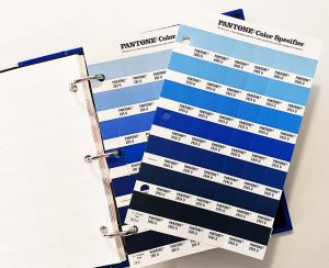
So, if you want to emphasize your company’s trustworthiness, how do you float to the top in a sea of blue? You’ll find that there really are lots and lots of blues to choose from as there are with any color.
From a design perspective, the three attributes of color are hue, value and intensity. Hue is what we typically think of as the name of the color, e.g. blue, green or red. Value is how light or dark the color is — expressed as tints (lighter versions) and shades (darker versions) of the color. Intensity regards the saturation of the color — the lesser saturated versions moving ever closer to gray. The nearly infinite variables of hue, saturation and intensity give a company nearly unlimited opportunities for its own unique color.
Since the hue ”blue” can be anywhere on the color wheel from near violet on the red side to near teal on the green side, there is already a wide range of blues to start with. Adjust the value and intensity and you get hundreds of options.
A good designer can work with you to find your corporate color sweet spot as well as develop an extended palette with more colors that support, complement or contrast with the primary color. These additional colors might be used for specific divisions in the company or special topics or product lines. A Brand Guideline document developed by the designer will specify how and when to use these support colors for consistency and impact.